Podcast Website Examples: What Good Show Sites Get Right
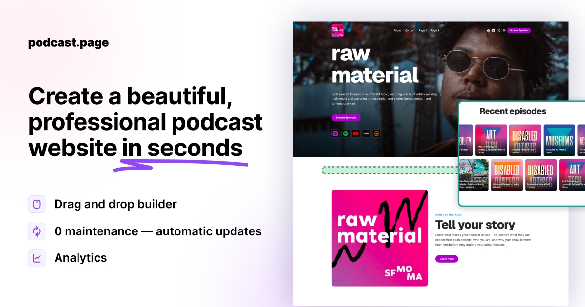

TL;DR
- Study real shows (Serial, Smartless, The Rest Is History) for structure, not colors: archive layout, listen CTAs, and episode pages matter more than fancy design.
- Run a 30-second audit on any example: hook above the fold, per-episode URLs, working mobile player, and subscribe badges before the footer.
- Copy section types from examples, not branding; podcast.page and similar RSS-driven builders turn those patterns into a live site from your feed.
Looking at podcast website examples is rarely about copying a design pixel for pixel. You want proof that a dedicated site can look professional, and a short list of patterns you can reuse without starting from a blank page.
The strongest podcast websites share the same job: help a new visitor understand the show in seconds, start listening with one click, and come back when a new episode drops.
Real shows worth studying (and what to copy from each)
Named examples beat abstract advice. These are live sites podcasters actually reference when they search for inspiration.
Serial (narrative / documentary). Season-based structure with a clear entry point per season. Copy the idea of grouping episodes by arc, not dumping 50 unrelated titles in one list. Individual episode pages carry the story context and listen path.
The Rest Is History (high-volume archive). The episode catalogue is filterable by era, series, guest, and topic. Copy the browsability: returning listeners need filters or search once you pass ~50 episodes, not just reverse-chronological scroll.
Smartless (celebrity interview). Strong brand homepage, latest episode up front, obvious app subscribe row. Copy the conversion layout: one hero episode, platform badges, then archive.
Lex Fridman (long-form interview + video). Clean episode index, each entry links to a dedicated page with player and notes. Copy stable episode URLs you can share in newsletters and on YouTube descriptions.
My Favorite Murder (community + monetization). Public episode archive plus a gated member area for bonus content. Copy the split only if you actually run memberships; otherwise skip the complexity and keep a strong free archive.
[Screenshot: side-by-side of episode archive vs single landing page layouts]
For more visual references, curated galleries like Beamly's podcast website examples list 30+ live sites by layout type (solo show, network hub, video-forward). Use them as a mood board, then reduce to the sections you will maintain.
A 30-second audit checklist for any example
Before you copy a layout, open the site on your phone and run through this list:
- Can you explain what the show is about within 5 seconds of landing?
- Is there a playable episode without digging past three screens?
- Does each promoted episode have its own URL (not only a feed of links)?
- Are Apple Podcasts / Spotify buttons visible without opening a hamburger menu?
- Do show notes render as readable text (not one unbroken RSS paragraph)?
- Does the latest episode on the homepage match what the host actually published this week?
If an example fails items 2, 3, or 6, it is pretty, not functional. Fix those three on your own site first.
What visitors expect on a podcast website
Before you pick colors or fonts, look at what recurring elements appear across shows that already have traction.
A clear value proposition above the fold. The homepage should answer who the show is for and why someone should listen. Strong examples put the show title, a one-line hook, and artwork together in the first screen.
Obvious listen and subscribe paths. Platform badges (Apple Podcasts, Spotify, YouTube, and others) should be visible without scrolling far. The best sites treat "start listening" as the primary action, not an afterthought buried in the footer.
An episode archive that is easy to scan. List or grid layouts with episode titles, dates, artwork, and short descriptions help returning listeners find what they want. Individual episode pages with embedded players and show notes perform better than a single page with every link dumped in one block.
About and contact paths. Host bios, sponsorship inquiries, and press kits belong on dedicated sections or pages. Examples that feel "complete" make it obvious how to reach the people behind the mic.
[Screenshot: homepage with hero, listen links, and latest episode section]
Four layout patterns that show up again and again
You do not need dozens of pages to match what works in the wild. Most effective podcast website examples fall into a few repeatable shapes.
Single-page landing sites
Popular with indie shows and link-in-bio traffic. One scrollable page covers the pitch, latest episodes, listen links, and a newsletter signup. Good when you promote primarily on social and want one URL to share everywhere.
Classic multi-page show sites
Home, episodes, about, and contact. This pattern scales well as episode count grows and gives each episode its own URL for sharing and search.
Network or brand hubs
Multiple shows under one brand, often with a shared header and show-specific subsections. The pattern matters less for solo podcasters but is useful if you run a small network.
Video-forward sites
Video podcasts add a prominent player or embed on the homepage and episode pages, with audio listen links still available for people who prefer podcast apps.
[Screenshot: episode list page with thumbnails and dates]
Sections worth copying from top examples
When you audit podcast website examples, note which blocks actually earn clicks rather than which ones merely look busy.
| Section | Why it works |
|---|---|
| Latest episode highlight | Surfaces fresh content immediately |
| Episode grid or list | Makes the archive browsable |
| Listen on [platform] row | Removes friction for new subscribers |
| Newsletter signup | Captures visitors who are not ready to subscribe in an app yet |
| Host about block | Builds trust for interview and niche shows |
| Stats or social proof | Useful when download numbers or reviews are strong |
| Sponsorship / contact CTA | Turns traffic into revenue or partnerships |
Not every section belongs on every show. A weekly interview podcast benefits from a strong archive. A seasonal narrative show might emphasize one flagship season page instead.
What separates forgettable sites from strong ones
Weak examples usually fail on clarity, not aesthetics. Common gaps include missing episode pages, listen links that open confusing intermediary pages, show notes copied from RSS with broken formatting, and homepages that never mention what the show is about.
Strong examples keep the feed of new content automatic. When the host publishes through their podcast host, episode pages and the homepage update without manual uploads. That consistency is why many podcasters move away from generic site builders that treat each episode like a blog post you paste in by hand.
If you want a gallery of layouts built specifically for shows, the podcast website examples page on this site shows template starting points you can customize after importing your RSS feed.
How to use examples without overbuilding
Start with the smallest site that serves your promotion channels.
If most listeners find you on Instagram or TikTok, a focused landing page with your best episodes and listen links may be enough. If you rely on Google search and email, invest in episode pages with readable show notes and stable URLs.
Pick one example whose structure matches your goals, list the sections you actually need, and skip the rest. You can always add a sponsorship page or resources section later.
How to create a podcast website walks through turning a chosen layout into a live, feed-synced site.
Frequently asked questions
What should a podcast website include at minimum?
At minimum: a homepage that explains the show, listen/subscribe links, and a browsable episode list with individual episode pages. About and contact sections are recommended for most shows.
Can I copy another podcast's website design?
Copy the structure and section types, not branding, artwork, or copy. Use examples as a checklist for layout and content, then apply your own visual identity.
Do I need a separate page for every episode?
Individual episode pages help with sharing, search, and embedded players. A single archive page works early on, but episode URLs become more valuable as the catalog grows.
Where can I find podcast website templates instead of building from scratch?
Template galleries aimed at podcasters give you the section patterns from strong examples without custom development. Browse podcast website templates if you want a structured starting point tied to your feed.